Badge styles
- Horizontal pill — best for headers, footers, and inline placement next to other partner logos
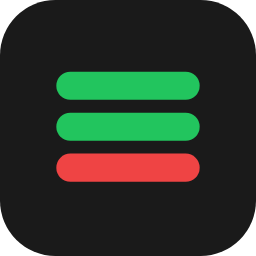
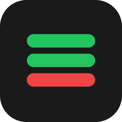
- Stacked compact — best for sidebars or any vertical layout
- Outline — most subtle, best for footers or where minimal visual weight is needed
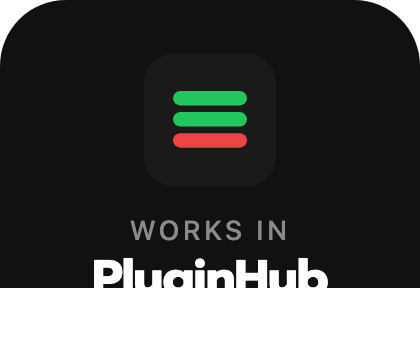
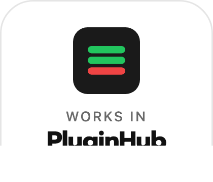
Each badge comes in a Dark version (use on light backgrounds) and a Light version (use on dark backgrounds).
Do
- Use the badge on your product pages, software pages, or anywhere you list the platforms your plugins are compatible with
- Maintain at least 16px of clear space around the badge on all sides
- Link the badge to https://pluginhubapp.com when used as an interactive element
- Choose the dark or light version based on your background — readability matters most
Don't
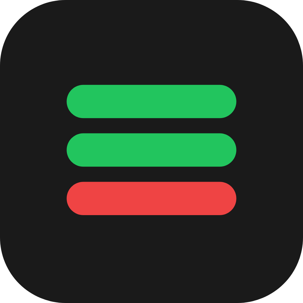
- Don't recolor the bars (green/green/red is the brand)
- Don't separate the icon from the wordmark within the same badge composition
- Don't add drop shadows, gradients, glows, or other effects to the badge
- Don't rotate, skew, or stretch the badge
- Don't display the badge smaller than 16px tall (mark) or 24px tall (full badge)
- Don't use the badge to imply official endorsement, partnership, or certification beyond plugin compatibility
Naming
Always written as PluginHub — one word, two capital letters. Not "Plugin Hub", "Pluginhub", or "PLUGINHUB".
Recommended placements
- Product page — near the platform compatibility list (Mac / AAX / VST / AU)
- Footer — alongside other partner or integration badges
- Marketing emails — near the "Compatible with…" section
 PluginHub
